Some photos I shot last week about caring for elderly family members ran as the Sunday center piece today. I was kind of surprised what and how they ran, so I'll post what I would have run here.

Actually I'm pretty sure I know why they didn't run this photo, It really doesn't have much to do with anything, but I love it. I thought her expression and framing were nice. And not to brag, but how perfect is that lighting? Flash Master, I say.

They did run this photo, but they cropped down close on the subjects and made it a square. As a general rule I hate square photos (they're just not aesthetically pleasing). I was really into shooting wide and taking a stepping back at this assignment. It gives it more of a quiet, fly on the wall look, I think, like I wasn't even there. Although maybe the extra room around the subjects is more distracting than informative in this photo. I don't know.

And finally some telephoto action with a side remote light I shot while the reporter was doing the interview. This was actually the lead photo in the paper today, but here it is without the headline filling up the dead space in my photo.
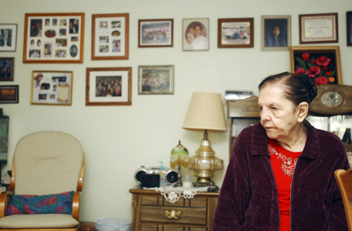 Actually I'm pretty sure I know why they didn't run this photo, It really doesn't have much to do with anything, but I love it. I thought her expression and framing were nice. And not to brag, but how perfect is that lighting? Flash Master, I say.
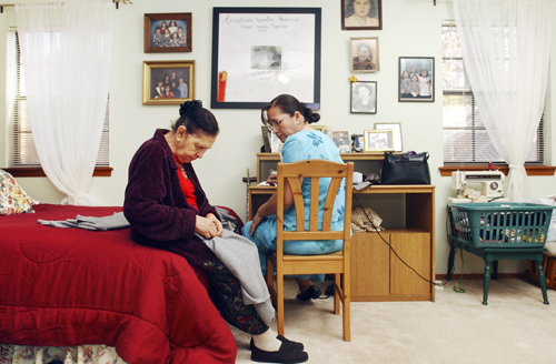 They did run this photo, but they cropped down close on the subjects and made it a square. As a general rule I hate square photos (they're just not aesthetically pleasing). I was really into shooting wide and taking a stepping back at this assignment. It gives it more of a quiet, fly on the wall look, I think, like I wasn't even there. Although maybe the extra room around the subjects is more distracting than informative in this photo. I don't know.
 And finally some telephoto action with a side remote light I shot while the reporter was doing the interview. This was actually the lead photo in the paper today, but here it is without the headline filling up the dead space in my photo.
2 comments:
I like the first photo too. I hear the design desk crops the hell out of photos sometimes. Shame really.
Then again, they crop my stories.
They Put TEXT ON YOUR PHOTO?!? Say it ain't so. Is that a regular thing?
Post a Comment